Monday, May 7, 2012

VIE: Friday the 13th Collection

Can you tell I love me some Virus Insanity?? lol! I purchased the Friday the 13th Collection while it was available, and I'm a little late posting (super sorry!). Anyway, the Friday the 13th Collection is ONLY available for one week immediately before and after Friday the 13th (there was one in April) - so it is only available for 2 weeks at a time. It is another duochrome collection, which is amazing! Anywho, I have lots of pictures for you <3


 Step On A Crack, 13, Bad Luck, Black Cat
 Step On A Crack, 13, Bad Luck, Black Cat
 Step On A Crack, 13, Bad Luck, Black Cat
 Step On A Crack, 13, Bad Luck, Black Cat


Aren't they pretty and fun???  I love this collection. Here is how VIE describes the colors:
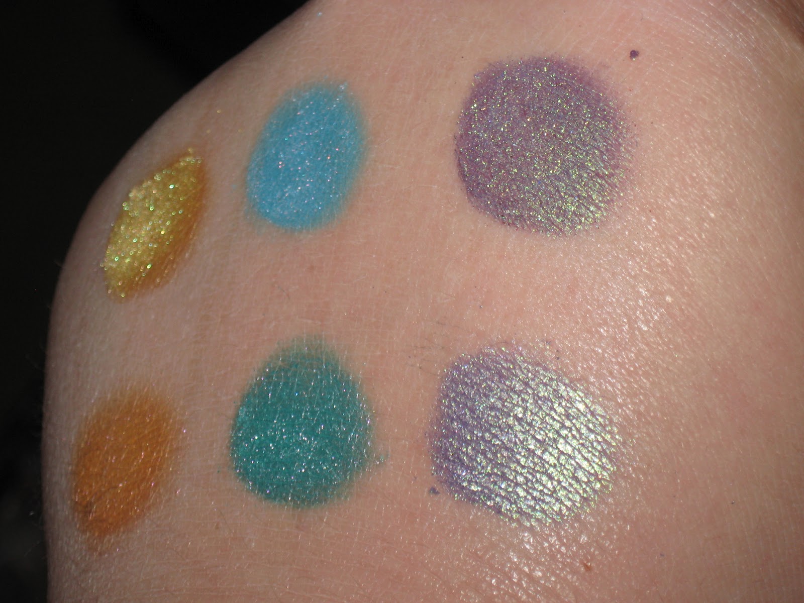
Step on a Crack: Duochrome color. Earthy green with iridescence that shifts from bronze to reddish gold.
13: Duochrome color. Warm pink with iridescence that shifts from bronze to red to purpleish.
Bad Luck: Duochrome color. Pinkish purple with iridescence that shifts from purple to blue to teal.
Black Cat: Duochrome color. Deep blackened blue with iridescence that shifts from red to copper to gold.


I swatched them for you, too... over Crazy Primer, bare skin, and then foiled.
 Black Cat, Bad Luck, 13, Step On A Crack
 Black Cat, Bad Luck, 13, Step On A Crack
 Black Cat, Bad Luck, 13, Step On A Crack
Black Cat, Bad Luck, 13, Step On A Crack


It is SO stinkin hard to capture the color shifts on camera!!! I really love Bad Luck and Black Cat (I think it's just that I really love purples!) Okay, so... I'm trying to do comparisons, to really "review" the colors, per se, although I'm not very good at it [[yet]]. Let's see... Step On A Crack is similar to Ireland, but Ireland is a more yellow base with very light shifts. 13 is far more pink than I Love You (I don't own any other released pink duochromes).  Bad Luck, a first glance, reminded me of a duochrome version of Heaven's Mirror (from Markie's Video Game Collection) which is a medium purple with turquoise glitter - but Heaven's Mirror is NOT a duochrome; it is similar to Mischief, which is a more muted purple with warmer shifts; it is also VERY similar to Lafayette, which is a darker, cooler purple color with very similar shifts (almost a dupe). Black Cat has a couple colors it is similar too: Luxuria which is far more blue and silvery; Full Moon which is an ever so-lighter, more blue color, and more silvery/shimmery with teal specks [not a duochrome, either]; Haunted (from the 2011 Halloween Collection) which is FAR more rosy. Overall, these colors are gorgeous, and next time there's a Friday the 13th - I would totally check these out!!


 Bad Luck, Black Cat, and 13
Bad Luck, Black Cat, 13 (sry again for my eyebrows...)


Did you get the Friday the 13th Collection while it was available? Will you be purchasing it next time it's up for grabs? And do you like this comparison-style review/swatching? Please give me some feedback in the comments or on my facebook page - when people read my blog and give me feedback, it makes me want to write more!!!


~Painted Nymph


Disclaimer:
All thoughts and opinions expressed are solely mine and all products were purchased by myself. I was not compensated for this in any way.

Sunday, May 6, 2012

Virus Insanity: Seven Deadly Sins

Soooooo.... Virus Insanity created a "Seven Deadly Sins" Collection and I bought it as soon as I could afford it! Its a gorgeous collection of 7 duochromes. The names are in latin, but she translated them on her FB page:


Superbia = Pride
Luxuria = Lust
Ira = Wrath
Gula = Gluttony
Invidia = Envy
Avarice = Greed
Acedia = Sloth


So it's not like every other collection, and the colors are just so pretty! Would you like to see them? huh? huh? huh??? :)


 Superbia, Luxuria, Ira, Gula, Invidia, Avarice, Acedia
Superbia, Luxuria, Ira, Gula, Invidia, Avarice, Acedia

These are all duochromes. Here is how Virus Insanity describes the colors:
Superbia: Duochrome color. Pinkish purple with iridescence that shifts from red to copper to gold.
Luxuria: Duochrome color. Deep blue with iridescence that shifts from reddish gold to bronze.
Ira: Duochrome color. Brick red that shifts from a pinkish red to coppery red, to golden red.
Gula: Duochrome color. Golden orange with iridescence that shifts from green to rose.
Invidia: Duochrome color. Deep green with iridescence that shifts from lilac to red to silver to greenish blue.
Avarice: Duochrome color. Yellowy green with gray tones. Iridescence shifts from blue to golden green to silvery green.
Acedia: Duochrome color. Very light blue with iridescence that shifts from silvery green, to blue, to golden green.

I did swatches and took several pictures in an attempt to capture some of the color shifts (which are really, truly, incredibly difficult to photograph!) The top is over Crazy Primer, the middle is swatched on bare skin, and the bottom is foiled.

 Superbia, Luxuria, Ira, Gula, Invidia, Avarice, Acedia
 Superbia, Luxuria, Ira, Gula, Invidia, Avarice, Acedia
Superbia, Luxuria, Ira, Gula, Invidia, Avarice, Acedia


I don't really know what else to say about these colors, except that the more duochromes Virus Insanity makes, the better they seem to be getting!! I do think Ira is one of my new favorite colors - it's like the red I've been searching for!!! Not a very strong, bold color shift - but I'm totally okay with that because it is a beautiful deep red color that doesn't look muddy. Superbia is similar to Be Mine, but Be Mine has more blue shifts; also similar to I Love You, but I Love you has a more muted, mauvey base and Superbia is a very true medium purple base with very warm shifts. Luxuria is similar to XOXO, but XOXO is a lighter blue with cooler shifts and Luxuria is borderline indigo-blue with warmer shifts. Gula is darker than Childish, which is almost more of a peach base, and Gula is more orange; also not as gold as Pinch MeInvidia just doesn't even compare to any other colors she currently has, it's such a beautiful, rich deep green. Avarice is a cooler light green than Ireland, which has warmer shifts, as well, and not quite as bright as Zombie Bitch (from the 2011 Halloween Collection). Acedia is a lighter, almost icy-blue in comparison with Foolish, which is more of a turquoise, and has much cooler shifts than Trickster, which has very, very (strong) warm shifts, and much paler than Bill (from the True Blood Collection).

 used Gula, Avarice, and Invidia over Crazy Primer (I had a small amount if Ira on my lower lash line that I didn't realize wasn't removed completely until after I had taken these pictures - sorry!!!)
sorry I was a lazy bum and didn't do my eyebrows... but these colors were SO easy to blend!

Overall, a beautiful collection. Unique colors with unique names. I'm happy I got them! What do you think? Have you purchased the collection yet? Do you plan to? Don't forget to check out the new Virus Insanity Website - it's a work in progress for now (still adding colors), but there are a lot of items on there!

Also, the comparison of each individual color with other colors VIE has made - do you like that? yes or no. I'd really love some feedback!!! Leave a comment or let me know on my facebook page. Thank you!

~ Painted Nymph

Disclaimer:
All thoughts and opinions expressed are mine and mine alone, and all products were purchased by myself; I was not compensated in any way.

Wednesday, April 25, 2012

Why I love VIE

Okay, so... if you've seen my mineral pigments collection, you'll see most of my pigments are from VIE, or Virus Insanity Eyeshadow. It was founded by a gorgeous girl named Jenni (you can find her in most of the promotional pictures and she is behind the eye in all of the photos on the VIE website). I really love this company for a few reasons, and I wanted to share why...


this is an old picture - my collection has since grown!

• VIE is one of the first indie makeup companies I found, and the first one I made a purchase from
• VIE has never shied away from sharing what ingredients are in their products and whether they are vegan or not (when asked).
• VIE knows the FDA laws and regulations, and follows them for her cosmetic products.
• VIE is always straight-forward about her processing/TAT (turn-around time) and it is usually 3-10 business days - as with any other business, this does not include weekends or federal holidays.
• VIE offers accurate product descriptions for all their products, and every color/product is clearly marked
• VIE offers long-standing "deals" or sales, as well as fairly regular specials, and free shipping happens pretty often.
• VIE does not produce drama or bring private issues to their business page - business is business, and it stays that way.
• VIE takes every precaution to protect their customers (gloves, masks, etc, and even stopped production when sick)
• VIE offers outstanding customer service, and they're very helpful and personal in their service!

All of these things are OUTSTANDING things to look for in a company, in my eyes. Honest, reputable, kind, drama-free, good customer service.... There are a lot of companies out there with these qualities! But VIE was my first, and has a HUGE selection of colors that offer great color payoff and long-lasting brightness.

Why am I sharing this? Because VIE is looking for promoters with a high fan base (I certainly don't qualify - 9 followers on this blog and less than 200 fans on my facebook page. But I'm hoping someone will see this that qualifies and look into it! I love trying new companies, but I will always stand behind my first love <3

If you haven't already, please check out Virus Insanity and consider making a purchase - you won't regret it!

~ Painted Nymph

DISCLAIMER:
All opinions expressed are mine and mine alone.

Tuesday, April 24, 2012

Femme Deceit Cosmetics Swatches

I know, I've been way slow at writing... I need to get better! Anyway, I made this order April 4 and I received it April 14, which is pretty quick turn around for an indie company, in my book!


So, Femme Deceit Cosmetics was having a cute sale with $3 pigments in fun little Easter eggs! So, I decided to check it out. I got on their website and I was initially a little lost, to be honest. I found it rather confusing (but I'm not so very techno-savvy, so I may be the only one). However, once I found where I needed to be, you can NOT miss the info about adding shipping to your cart, which I found a little bit strange... It's the only shop I've ever seen that you have to add the shipping to your cart, as an item. You also have an option to add Confirmation/Tracking for $2.00, which I prefer, but did not add b/c I know that sellers can add Confirmation for free through Paypal. [[I should add, a tracking number WAS added to my order when it shipped, even though I didn't choose it]] So I added the shipping to my cart, and then proceeded to the Easter Egg Hunting pigments, and saw that there were no color descriptions offered under the sale, so I toggled back to my open window of the FDC facebook page to see if there were any color descriptions offered there, but alas... there were not... So I started browsing around on their website, but still no color descriptions - just small pictures of pigment. So I took some wild guesses and chose 3 pigments.


My package arrived safe and sound in a small flat rate box


...and smothered in glitter. lol There was also a cute cellophane bag inside the tissue paper that the eggs and card were packed in, and glitter sprinkled in there, as well. It was adorable, but it made a bit of a mess... However, the eggs were ADORABLE and I was actually pretty elated that  I -actually- got cute eggs in my order! My kids stole them from me... but they were awesomely fun while I had them!!!!


Somehow, the glitter (it is craft glitter) ended up all the way inside one of my pigment lids, inside the egg (luckily the sifters are sealed!)

 Not sure if you can see it in the picture... But I was able to get all the glitter out with a pair of tweezers.


I ordered Jaded, Goldilocks, and Team Edward
 top
 bottom
       Jaded,                   Goldilocks,               Team Edward
     Jaded,                     Goldilocks,                   Team Edward

Jaded is the only pigment that included ingredients. And the labels on the lids are actually INSIDE the lids, not outside; very different.


Here are my swatches... On the left is over primer, middle is bare skin, on the right is foiled. Top to bottom is Team Edward, Goldilocks, Jaded.


These colors were smooth, and went on easily. They are very pigmented; even on dry skin the color came out great. Since there were no color descriptions from the company, I'll do my best to describe them... Jaded applied as a satiny emerald green with some shimmer, and when foiled had a metallic effect. Goldilocks was a very metallic yellowy gold color that had intense color when foiled. Team Edward was a metallic red that looked more like a deep rosy-red when foiled. All were strong, and none left a stain on my hand (I left the swatches on my hand for approx 2 hours), not even Team Edward where it was foiled. These colors went on silky smooth and had beautiful color pay off.


They also blended BEAUTIFULLY and were very easy to apply. I didn't have to pack the color on for payoff, not even the yellow color. I did this with Goldilocks and Jaded.


So, overall, I was not very impressed after my initial ordering experience and the glitter was a little too much for me (while it was cute, I had to stop everything I was doing after I opened the package to vacuum my carpet), the products were awesome. I would definitely order some more. there are a couple gorgeous stackers on Femme Deceit Cosmetics' website (including a Pocahontas stacker I've got my eye on!). Do you own any Femme Deceit Cosmetics? What is your favorite product?


~ Painted Nymph


DISCLAIMER:
All opinions expressed are mine and mine alone and I have not been compensated in any way. These products were purchased by me with my own money.

Wednesday, April 18, 2012

RockABetty Beauty Samples

So, I ordered the RockABetty Beauty "newbie" kits she posted the other day... it was only $0.20! Plus $2.50 shipping, so it was a steal! It got to me pretty quickly. I lost the candy that came in it the moment I opened it (I have two small children...) but here is what I got for only $0.20!


I got samples of Chainsaw Massacre, Death Becomes Her, and Cemetery Road "Lid Luster" eyeshadows, and Death and Lust lipgloss along with two SUPER cute stickers and a double-sided mini brush!!! (and candy that was stolen by little fingers lol)


Here's my swatches (primer, bare skin, foiled):
 top to bottom: Chainsaw Massacre, Death Becomes Her, Cemetery Road
 top to bottom: Chainsaw Massacre, Death Becomes Her, Cemetery Road
left to right: Cemetery Road, Death Becomes Her, Chainsaw Massacre


These colors were really pretty and pigmented and went on very smoothly and the colors were just absolutely STUNNING foiled - especially Cemetery Road. Chainsaw Massacre is described as a metallic silver loaded with blood red glitter. Death Becomes Her is described as a shimmering black-based purple shade that color shifts from pink to purple to blue to black Cemetery Road is described as a medium brown with a color-shifting green/blue base with a ton of gold and green sparkles. I think the descriptions are completely accurate and the color-shifting colors are exceptionally visible in Cemetery Road, particularly when it is foiled (I was completely captivated by it!)


I used Chainsaw Massacre and Death Becomes Her for a simple look


I used Chainsaw Massacre on my lid and Death Becomes Her in my crease, outer V, and lower lash line and it blended beautifully and everything stayed in place amazingly well. (I know it's hard to see in the pictures, it was more obvious in person, though.)


Death and Lust is described as a clear, sticky lip gloss loaded with carnation pink, rose, and deep red glitter.  My first impression was that there were two different size glitters, but it is definitely LOADED with glitter. I put it on with my finger, but I think next time I'll use a lip brush; it was hard to evenly distribute the glitter. It was the slightest bit gritty, but the gloss itself wasn't overly sticky and didn't feel drying. It actually stayed moderately moist for longer than I expected.


Overall, I was really happy with my experience! The etsy shop is easy to navigate, the owner is a sweetheart, and the products are gorgeous. I look forward to making another (larger) purchase! Do you own any RABB? What's your favorite product?


~ Painted Nymph

Sunday, April 15, 2012

VIE's April Fool's Collection 2012

So, Virus Insanity Eyeshadow has created yet another gorgeous collection and I got it about a week ago (I've been slacking, I know!) but I wanted to share! It's another duochrome collection, which are so much fun! Duochromes, as described by VIE are "many different colors at once. They are incredibly hard to photograph, in person these eyeshadows are much more dynamic and the color changing effect is much more obvious." Because of this, my swatches include several angles of the colors, to ATTEMPT to show the gorgeous changes/shifts in color. There are 6 colors in this collection: Shenanigans, Mischief, Trickster, Foolish, Pranked, Childish. Lemme just show you :)

 Childish,      Pranked,       Foolish,       Trickster,     Mischief,   Shenanigans
 Childish,      Pranked,       Foolish,       Trickster,     Mischief,   Shenanigans
 Childish,      Pranked,       Foolish,       Trickster,     Mischief,   Shenanigans

Here is how the colors are described on VIE's website:
Childish - a warm peachy yellow with iridescence that shifts from lilac, to reddish, to silvery.
Pranked -  a tan with iridescence that shifts from blue, to silvery green, to golden green.
Foolish - a teal with iridescence that shifts from blue, to reddish, to lilac.
Trickster - a light shimmery blue with iridescence that shifts from red, to copper, to gold.
Mischief - a light shimmery purple that shifts from rose to green.
Shenanigans - a deep, plummy purple with iridescence that shifts from green to rose.

Swatched over Crazy Primer
 Pranked            Trickster          Shenanigans
Childish             Foolish                Mischief
  Pranked            Trickster          Shenanigans
Childish             Foolish                Mischief
  Pranked            Trickster          Shenanigans
Childish             Foolish                Mischief
  Pranked            Trickster          Shenanigans
Childish             Foolish                Mischief
  Pranked            Trickster          Shenanigans
Childish             Foolish                Mischief

Swatched Dry on Bare Skin:
  Pranked            Trickster          Shenanigans
Childish             Foolish                Mischief
  Pranked            Trickster          Shenanigans
Childish             Foolish                Mischief
  Pranked            Trickster          Shenanigans
Childish             Foolish                Mischief
  Pranked            Trickster          Shenanigans
Childish             Foolish                Mischief
  Pranked            Trickster          Shenanigans
Childish             Foolish                Mischief

Foiled:
  Pranked            Trickster          Shenanigans
Childish             Foolish                Mischief
  Pranked            Trickster          Shenanigans
Childish             Foolish                Mischief
  Pranked            Trickster          Shenanigans
Childish             Foolish                Mischief
 Pranked            Trickster          Shenanigans
Childish             Foolish                Mischief


I will say that Shenanigans stained my skin just a little when applying it foiled, but that seems to happen to my skin with any deep violet or red colors. However, I really enjoyed the color shifts in these. Even applied dry, these had a pretty duochrome effect, although dry, Shenanigans also looked incredibly PINK, more than when applied over primer or foiled. These colors are VERY pigmented, and I just thought this looked cool when I took off the foiled swatches, so I wanted to share:


Idk. I thought it looked artsy. lol (it's a baby wipe)

Here's a look I did before I went out using a few of the colors from the collection... I used Mischief on the inner lid, Shenanigans on the outer lid, and Trickster below - I've been obsessed with purple and turquoise together recently!


I think Triskster has the strongest duochrome properties... When I was wearing this, you almost couldn't tell I had a blue/turquoise color under my eyes. It looked very purple, but I LOVE it. Trickster was an appropriate name!

All in all, I think Trickster and Shenanigans are my favorite colors from the collection. What are your favorites? Will you be purchasing any? Or do you already own the April Fool's Day Collection? 

~ Painted Nymph